Thursday 30 April 2015

Getting to Grips with Graphik

Hello and welcome to my 1st Inspiration Post for Stamps and Stencils. I'm Sharon and what a hard ask I've got, following the fantastic posts from Toni and Ruth.

I have recently discovered Derwent Graphik Pens, they are available in singles, small packs or the full collection of 20. They are the best value so I just had to have them...... They come in a handy storage box and have to be stored horizontally.


I started by drawing some lines to see how the ink flows, you can fill in with some colour they are very opaque!


You can also flood the nib, which is a good effect when you blow it to make a splatter.


Lines filled in splattered and then blending with Distress Inks over the top..


White card sprayed with Dylusions Ink Spray then black gesso applied with a piece of cut and dry through a stencil. I have written a few words to see how they reacted with the gesso. They were fine and I did not have to wait too long, it is a super nib which does not fray or split on rough surfaces.
It seems to be made of nylon.

After a bit of practice and playing I got out my new Journal the pages are craft paper. I started with covering the pages with Liquitex Gesso and then blending some Paper Artsy Fresco Finish Chalk Acrylics for the base of the background. 


When I had enough of the background covered I painted the page with Golden Fluid Matte Medium.
The reason for this was I discovered the pens will sometimes flood so if there was any accidents it was easy to remove the paint straight away....


I love to doodle and Zentangle, I find it very relaxing and it gives me time to think of my next project?
Here I quickly draw around the leaves, added some dots and lines the pens really cover over the surface well and don't get clogged up.


More doodling


Just a few of my favourite products


The completed page with a quote from a Unity Stamp by Donna Downy
"Enjoy Explore Believe"
Could not have said it better myself.


The quote is stamped using Archival Ink on a piece of ATC size watercolour paper  which is blended with Tim Holtz Distress Inks.


Extended the leaves onto the card at the top.


By the way I do have more than 1 stencil, this just happens to be my favourite at the moment.


I tried the pens over a variety of paints, pastes gesso even Panpastel with no problems at all. I can see these are going to be my favourite Journaling pens, I would just be aware of flooding the nibs but you can see it start, usually with a bubble. Hope this does not put you off trying them out. 
Going on holiday these would be great to add to your travelling kit and they will not take up too much space.


Hope I have not bored you too much, thank you for joining us at Stamps and Stencils, don't forget to press the follow us button it would be great to get to 100 followers in the 1st month.

Sharon xx


Thursday 23 April 2015

Hot Wax!

Hi everyone, Ruth here with my first inspiration post...eek! here goes...I've recently become fascinated with encaustic painting and have a desire to replicate some of those wonderfully luminous, layered mixed media pieces that are out there. Having looked into it, encaustic boards and paints can be quite an investment so I thought I would start small and use the equipment I already have to start exploring this wonderful art form....and maybe inspire you along the way.


The pieces I've created above are on 2" square pieces of stamp board (anyone else have stampboard stashed away?) I didn't intend to create such small pieces as I also had some larger squares but it's just the way it went.

I'm not about to give a run down of equipment and all the mediums you can use with encaustic work, it's too large a subject. I'm also only just beginning so my knowledge is very limited! I will put some links that have inspired me at the bottom of the post and I can also highly recommend  a book I recently received which is fast becoming my bible for this journey. It's 'Encaustic Painting Techniques - The whole ball of wax' by Patricia Baldwin Seggebruch.


However I will mention a few basic things.

  • The surface you work on has to be rigid and absorbent, so ampersand bords (stampboard), birch plywood or HDF painted with encaustic gesso are a few options. I had some 2" square dense chipboard pieces above which I also used and worked, I think because they were so small they didn't bend. 
  • Encaustic wax is beeswax with damar resin in it (a substance that gives durability to it), however beeswax will work fine and is what I've used in this post.
  • You need a heat source to keep the wax melted at about 80 -100degrees C. Anyone have a meltpot? If not you could use a pan on a griddle and put the wax in a tin on it. You also need a heatgun 
  • Brushes have to be a natural hair or they will melt, I used a hake brush, which was inexpensive.
  • Watercolours, oils, dye inks, alcohol inks, oil pastels, pan pastels can all be used but acrylics can make the wax lift...so until I become more confident I'm not going there.
  • Fusing...when you put a coat of wax on or add some oil pastel or paints you need to fuse that layer with a  heat gun, just heat till the wax goes from matte to shiny, no need to melt it all.
So were off, now as this is Stamps and Stencils, that is what I chose to use, I also used some 'scraps', dye ink pads and portfolio oil pastels. Apart from a melt pot masterclass with Hels Sheridan and a recent wax class that our DT leader Sue Carrington taught I have not made any other wax pieces so these are my first dabbles.


Wax is very forgiving, if you make a mistake just melt it off. My first piece didn't go according to plan and I was left with lines I'd scratched into the stampboard, not a problem. I said it's forgiving, wax softens sharp edges and gives a smooth sheen to everything, so even the roughest drawings and things you think are an almighty mess can turn out wonderfully with a coat or 2 of wax....honest.


 Heat the board before the first coat of wax to help it go on smoothly.


Oil pastel through a stencil, then fuse gently with a heat gun


Another coat of wax...and fuse


Portfolio oil pastel on an uneven surface, wipe away with a slightly damp cloth (oil if not water soluble pastels)


Wax left in dips...and fuse


Stamping...dry, wax layer...and fuse. A scrap of paper flower, wax layer.


Cutting in, I used a cutter to make an impression and then rubbed pastel into the crevice...like the pink board above. It can look quite cloudy at this stage but once cool a quick buff and a lovely sheen appears. So first piece done and I've explored a few ideas, not perfect but I had fun. 


Top - both are stamped with dye ink, bottom left is on chipboard and dye ink squiggles, last is stamped coloured paper and some tissue glued on and left to dry thoroughly.

Using ribbon to make an impression in the warm wax and then rub oil pastel on.

 Some stamped tissue paper circles and twine, 


Hope you can see the sheen on both of these


A piece of photocopy paper becomes translucent, some thread and red melted oil pastel


 Music paper and twine 


 The flourish can be seen behind the photocopy paper, 


the gold is mica powder, burnished on


If using metallics they need to be on the top layer or their sheen will just dissappear.


This is a larger piece which I made a right mess of when spraying dylusions through a stencil...but a layer of wax and it's softened and it's ready for whatever is coming next

Well done if you've got through that long, photo heavy post, it will be a short one from me next time!

I'll leave you with the links to  
Ruth x

Thursday 16 April 2015

Welcome to today's Guest Designer, Annie !

Today we are welcoming a Guest Designer who I know won't be a stranger to you. Annie of Curious and Crafty Treasures. I'm sure you'll all give Annie a warm welcome !

Hi everyone..it’s Annie here as Guest Designer for Stamps and Stencils challenge theme of 'Anything Goes’. 
I was so thrilled to be invited to take part in this month’s challenge, which is the first here at Stamps and Stencil’s blog. The  very talented Design Team have created some fabulous, inspiring projects and I hope you will find time to take part in this “for fun” challenge. 
As many of you know I  have been crafting for over 20 years dabbling in a variety of  styles, but mainly vintage/grunge. I am a huge fan of all things Ranger and Tim Holtz so of course I had to create a project using stamps/stencils and Idea-Ology pieces from Tim’s vast range. Mixed Media is fairly new for me but I am really enjoying the way that I can incorporate paints/gesso/texture paste in to  so many projects and it’s nice to recycle items too. 

For my project below I used the aluminium from a drinks can and some leather pieces from an old discarded purse in my stash. The large wooden tag was a recent purchase and was reduced to 50 pence in M&Co, so of course I just had to buy a few !!!!


Firstly I stamped on the aluminium using Jet Black Archival Ink from Ranger. ( see below) The gentleman is from Stamper’s Anonymous Tim Holtz Purveyor Stamp Set. A China Blue Distress Marker was used to colour the gentleman’s eyes.  To attach the aluminium to the leather I used my WRMK Cropodile to punch some holes and some nail headed brads.


The wooden tag was given two coats of Decoart Chalk Paint in Rustic, then Decoart Crackle Medium was applied. 


Once the crackle medium was almost dry I applied Decoart Chalk Paint in Whisper and you can see the fabulous crackle below. 


Decoart Media Texture Paste in Black was applied through Tim Holtz Cargo Stencil and also the Schoolhouse Stencil


Vintage Photo, Black Soot and Rusty Hinge Distress Inks were applied to the wooden tag, providing an aged appearance. Edging the tag with the Black Soot really defined the edges, making them pop.
I also applied some Vintage Photo and Walnut Stain Distress Inks to the edges of the leather.


Below is how the tag looked before I altered it.


And this is the finished piece……………..!!


Below is a closer look at the stamped images from the Purveyor Stamp Set. The  stamped papers were aged with Distress Ink and then wrinkled, spritzed and flicked with water. Some gears, a timepiece and spinner as well as a  metal wing complete the look.


Thank You once again to Sue, Yvonne, Julia, Toni, Ruth and Sharon for having me join in with them on this fantastic journey. I wish you all the very best and hope to catch up with you again. 

Crafty Hugs And Best Wishes

Annie xx

Apologies for the blip earlier with the photos not being loaded properly....these things do happen! 

Thursday 9 April 2015

Brushing Up On Brushos

Hi everybody! It's Toni here and I have the pleasure of presenting  the very first of our 'Inspirational Posts'. These posts will be popping up now and again, throughout the months, as we take it in turns to share some of our favourite products and techniques, which we hope will inspire and get those creative juices flowing. I've chosen to have a play with Brushos and this is what I've found out about these little pots of magic crystals !


Although they seem to be the new guys on the block, Brushos have actually been around for decades. I know this, because I had them in my classroom many moons ago! We used them as a dye substitute for colouring fabric. They are not fixable on fabric though, so it means that any fabric coloured with them,  must be for decorative purposes only.
Brushos crystals come in small plastic pots. A useful tip is to bodge a few holes in the top, a bit like a pepperpot, so that that they can be easily dispensed.
Here's a birds eye view of mine. I bought a set of eight colours and a single pot of Prussian blue. I started my experiments by firstly mixing a little of each colour with water in a palette. The colours are very intense so you only need very little. I jotted down the name of each colour, and painted a sample of each mixture on to a piece of water colour paper
On a second sheet, I spritzed each box with water and sprinkled the Brushos directly into each compartment. The colour spreads in a most fascinating way. I used these sheets as a colour reference for the rest of my experiments. I then cut lots of uniform squares of cream coloured card, approximately 12 x 12 cm. This is the size I often use in my card making, so it can be quite a handy for building up a supply of colourful  backgrounds. I started off by spritzing a piece of card with water and sprinkling on Lime Green Brusho, then spritzing the surface again to activate the crystals. This is what it looks like..
So the basic application I used is , spritz, sprinkle, spritz. You can decide whether to blot the surface or dry with a heat tool. I found that blotting the surface made the colours lighter and removed some of the detail.
 Here are some of my further experiments, I shall try and keep the details fairly brief but feel free to ask questions in the comments box if there is anything more you'd like to know.
In this group, the first picture is the background, next you can see the stamping, I used black Archival ink and heat embossed with clear embossing powder. The third picture shows where I have used bleach to remove the colour and highlight the eye. Bleach works really well, but observe all the usual cautions. Here are some more bleach experiments...
In the first picture, I applied the bleach to a rubber stamp with a blending tool, In the next two samples, I used the same blending tool to apply  bleach through a stencil. This was fast becoming a favourite technique, I love these effects.
Oops ! just found some more bleach effects. The first is Stamped, and in  the second one the colour has been removed with a fine paint brush. Do use a brush with man made fibres, as bleach will rot natural bristles. The background of the second sample has been sprayed. I made up a few Mini Misters with water and a tiny scoop of Brusho crystals. I used Rose Red and yellow Ochre on this one.
Tearing myself away from the bleach.......
In the first picture, I've used the Brushos to water colour the stamped image, in the second picture the sprayed background has been embossed with a script embossing folder, the writing was then highlighted with Treasure Gold paste applied with the back of a piece of Cut and Dry foam. In the third sample, I mixed a very small amount of Prussian Blue Brusho, into white embossing paste, and applied it through a Wendy Vecchi Stencil.
Three more, hope you're still with me ! The first one from this group, was initially stamped with Versa Mark and heat embossed with clear embossing powder. Brushos were then applied with the spritz, sprinkle, spritz and blot technique. In the next sample, I applied gesso through another of Wendy Vecchi's stencils, dried with a heat tool and then applied  Rose Red and Prussian Blue. In the third picture in this group, The Brushos were applied through a Layering Stencil using Mini Misters.
In this last group, the first one shows a background that has been embossed and highlighted with Treasure Gold. The second one has a Terracotta background, that also has a spritz of Tarnished Brass Distress Spray and a stamped image. It's a pity the glitz doesn't show up in these two as it goes really well with the Brusho colours. In the last sample, I've used the thickening powder, that came in the Brusho set, to make a paste. It's a bit like wallpaper paste, I spread it through a Layering Stencil and sprinkled some Brushos on top. I need a bit of practice with this as the paste is much thinner than embossing paste and is inclined to seep under the stencil, interesting though. 
So, what did I do with all my samples........
I mounted all the samples and made them into a book. I used my favourite bleaching technique for the cover, I think it's very 'batik like'. I also stamped over the with a crackle stamp to enhance the batik effect, The Seam Ribbon has also been coloured with Brushos too. Here's a close up of the cover
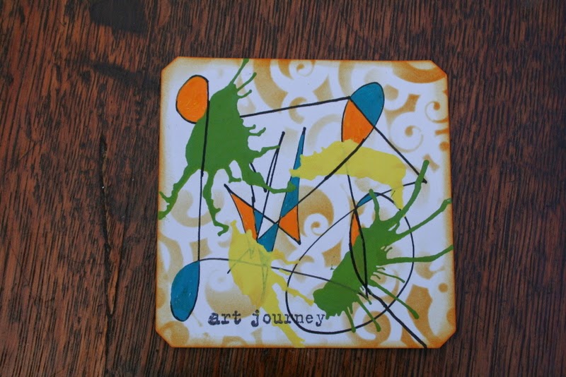
Well if you've managed to get to here, I applaud you !!!. As you may have guessed, I'm definitely loving my Brushos. They are a wonderfully simple product that hold a myriad of possibilities. The colours are very intense, so you need only to use very little, to get good results. I think they are great for making backgrounds for stamping, stencilling and embossing and they combine really well with Distress Ink. I blended Distress Ink around the edges of several of my samples. So if you've been wondering whether to take the plunge I can only say GO FOR  IT ! Until next time, happy crafting x.


Thursday 2 April 2015

Anything Goes !

Today is very exciting as it's the start of our very first challenge! We're keeping it easy too and starting off with Anything Goes ! We are a mixed media challenge so as long as your project follows this theme and includes either stamping or stencilling anything goes !

Please take time to read through the challenge rules which are at the top of the page, there's not many but to avoid disappointment please check them out. 

We don't have a prize to offer but we are here to have fun and share some tips and techniques along the way. We are a monthly challenge which will start on the first Thursday of each month. The winner of the challenge will be invited to join us as Guest Designer and will receive a winner's badge. The DT will also be choosing the top 3 who will receive a top 3 badge.

So, without further ado let's push on and see what the DT has created to inpsire you !


So now it's over to you, let your imagination run wild !